Read progress and the two losses
A training dashboard can show dozens of moving traces. Which one tells us whether the model is learning, and which one explains why it stopped improving? We will read the panels in a useful order, linking every number to a progress point, a definition, and a recorded source. Missing measurements will remain visibly missing.
Training loss is the objective evaluated on training examples. Validation loss evaluates the same rule on a held-out development set. Generalization means performance on examples not used to fit the parameters. The difference between validation and training loss is a useful comparison, provided both evaluations use the same objective and their averaging conventions are understood.
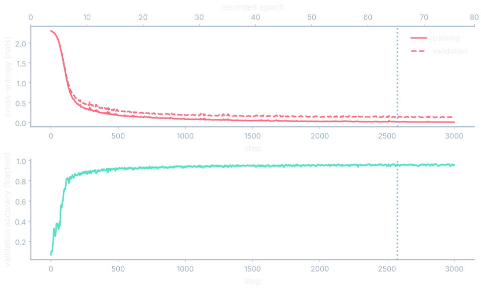
Start with E4’s recorded step and epoch. A step counts an update; the epoch counts consumed training examples relative to training-set size. The upper axis shows the corresponding fractional epoch. Accuracy is correct labels divided by evaluated examples. It is a task metric, a task-specific performance measure, and it need not move whenever the loss changes.
Read E4 at step 3000
Training loss is 0.008242 and validation loss is 0.128412. The gap is 0.128412−0.008242=0.120170. Validation accuracy is 0.961474. The best recorded validation step is 2577, at epoch 67.826667, with training loss 0.014011 and validation loss 0.124469. By step 3000, epoch 78.96, training loss is lower but validation loss is higher than that best value.
That comparison identifies a pattern to investigate. A single upward tick would be insufficient evidence of overfitting, because finite samples and changing parameters can make curves fluctuate. Inspect the raw trace over an interval before smoothing it. Smoothing may help reveal a trend, but it must not replace the raw measurements or change the value reported by a cursor.
Look inside the update
A gradient norm summarizes the magnitude of the loss sensitivities. A weight norm summarizes parameter magnitude. Both use the L2 rule: square entries, add, and take the square root. A global norm combines all entries, while a per-parameter norm describes one named array. Our records group parameter tensors; they do not silently combine weights and biases into module totals.
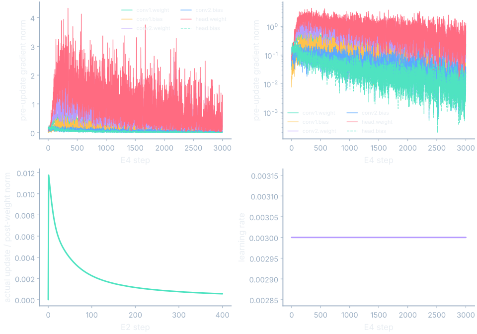
Let g denote the gradient vector. A spike in its norm says that the current calculation produced a larger sensitivity, not why that happened. Check the affected parameter arrays, the batch, the objective, and the learning rate. At step zero, a stored global gradient zero is an initialization placeholder; the gradient has not yet been computed.
$$ \|\mathbf{g}\|_2=\sqrt{\sum_i g_i^2} $$In words: square the gradient entries, add them, and take the square root.
The update-to-weight ratio compares actual parameter movement with post-update parameter magnitude. It is especially useful when an optimizer rescales gradients, because the raw gradient norm alone cannot reconstruct the update. Let θ, theta, denote all model parameters, and k the update index. The small denominator floor prevents division by zero.
$$ R_k=\frac{\|\theta_k-\theta_{k-1}\|_2}{\max(\|\theta_k\|_2,10^{-12})} $$In words: θ (theta) stands for all of the model’s parameters at once; divide their actual change’s magnitude by their post-update magnitude, with a small denominator floor.
An actual parameter-array ratio
From E2 snapshots 0 and 1, the 0.weight update norm is 0.02499944219377699 and its post-update norm is 2.0023683407680015. Their ratio is 0.012484936804478512. For 0.bias the ratio is 0.012264304419875837; for 2.weight it is 0.009189455241758484. For 2.bias it is 1.0 because the initial bias was zero and the new bias equals the update. These values derive from stored six-decimal tensors.
There is no universal healthy ratio threshold. A value of one for an initially zero bias need not signal a broken run. Compare the denominator convention and the associated loss behavior. E4’s learning-rate trace is constant. A separate illustrative step schedule uses 1/2 initially and 1/4 after its midpoint; those values are not E4’s settings.
A single norm can hide many values
A single magnitude hides how entries are distributed. A histogram counts values in ranges called bins. Two arrays can have similar norms while one contains many small entries and another concentrates its magnitude in a few large entries. Looking at the distribution and selected individual values helps distinguish those cases.
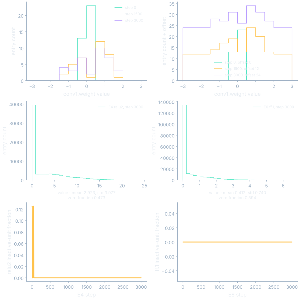
The weight histograms use twelve fixed bins over [−3,3]. Values outside that range are omitted from the bin counts, so the viewer discloses the omitted count. Overlay and offset views show distributions at several recorded steps. Offsetting a histogram vertically is a display choice; the shift must not be mistaken for additional entries.
Standard deviation measures spread around the mean: subtract the mean from every entry, square those differences, average them, and take the square root. A zero fraction counts exact zeros divided by the number of inspected values. Activation statistics here come from the last validation forward pass, not the training mini-batch used to estimate an update.
Inspect [0,0,1,1]
The mean is 1/2. Every squared deviation from that mean is 1/4, so their average is 1/4 and the population standard deviation is 1/2. Two of four entries are zero, so the zero fraction is 1/2. These quantities answer different questions even though their numerical values happen to agree in this example.
A dead unit produces zero for every inspected example. A high layer zero fraction alone does not establish that every unit is dead, or that any unit is permanently inactive. E4 records explicit relu1 and relu2 outputs; E6 records the post-ReLU ff.1 module. Their per-step inactive-unit fractions state which units were zero across that step’s validation forward.
Track throughput, memory and saved states
Throughput asks how many examples were processed per second, but its timing boundary matters. E4’s instrumented rate includes updates and full-split evaluation with diagnostic hooks. Its batch-wait interval measures in-memory batch preparation. A slow trace can suggest where to inspect, but it cannot establish that an unmeasured GPU was idle.
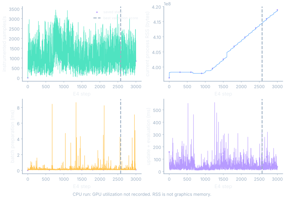
E4’s measured current process RSS, resident memory in RAM, ranges from 396419072 to 418881536 bytes in the recorded series. RSS is not VRAM. The timing panels separately show wait_ms and compute_ms; the latter includes update and evaluation work. Comparing those boundaries is more informative than interpreting either number as generic “training time.”
Saved-state markers come only from snapshot keys. A best-so-far score comes from the cumulative minimum of validation loss. The best score may occur between saved snapshots, so a “best” marker does not guarantee an exact parameter file exists for that step. A complete resume checkpoint would also require optimizer state beyond these parameter snapshots.
Some panels are pictures with numbers
Some recorded quantities are arrays whose arrangement carries meaning. A kernel is a small shared image-weight grid. A feature map is its response across spatial locations. A hidden state carries numerical memory along a sequence. Attention weights are normalized mixing shares over positions. We will learn the detailed architectures later; here we can already inspect their recorded values.
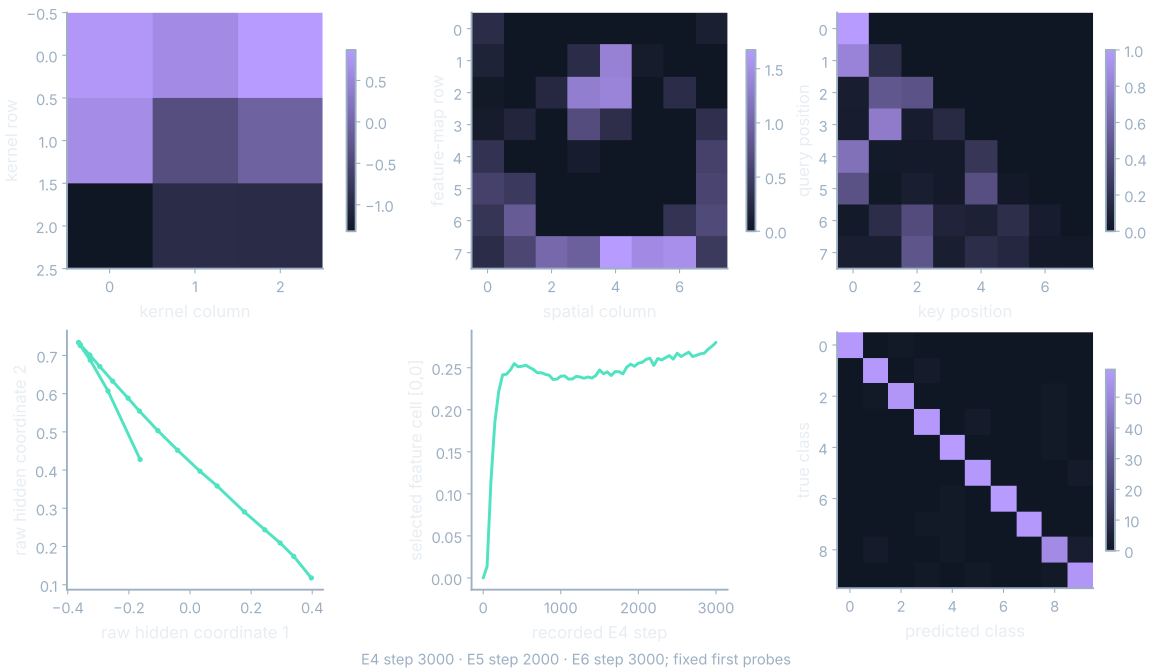
Every panel needs a probe identity and an actual recorded step. A feature map from a fixed input example is different from a weight kernel, even if both appear as small grids. Selecting a cell reveals a number and a trace over available frames. A raw two-coordinate hidden-state view is not a computed dimensionality-reduction projection.
Read the evaluation grid
A confusion matrix counts true-class rows and predicted-class columns. E4’s final diagonal is [58,58,57,58,59,58,59,58,52,57], totaling 574 correct cases. Recall for a class is its diagonal count divided by its row sum. Precision is that same count divided by its prediction-column sum. An empty denominator leaves the corresponding ratio undefined.
Off-diagonal cells locate specific confusions. They do not supply probability thresholds, because counts alone do not retain the assigned probability of every example. The recorded E4 probability arrays support richer evaluation later. In this dashboard, per-class curves derived from confusion matrices show recall and precision against training progress, not threshold-sweep curves.
Learning, stuck, overfitting or diverging?
Underfitting means a fitted model still misses important structure in its training examples. Overfitting means fitting details that fail to transfer to held-out data. Divergence describes unstable increasing error or nonfinite computation. A nearly flat score is a plateau, but the visible shape alone does not identify its cause.
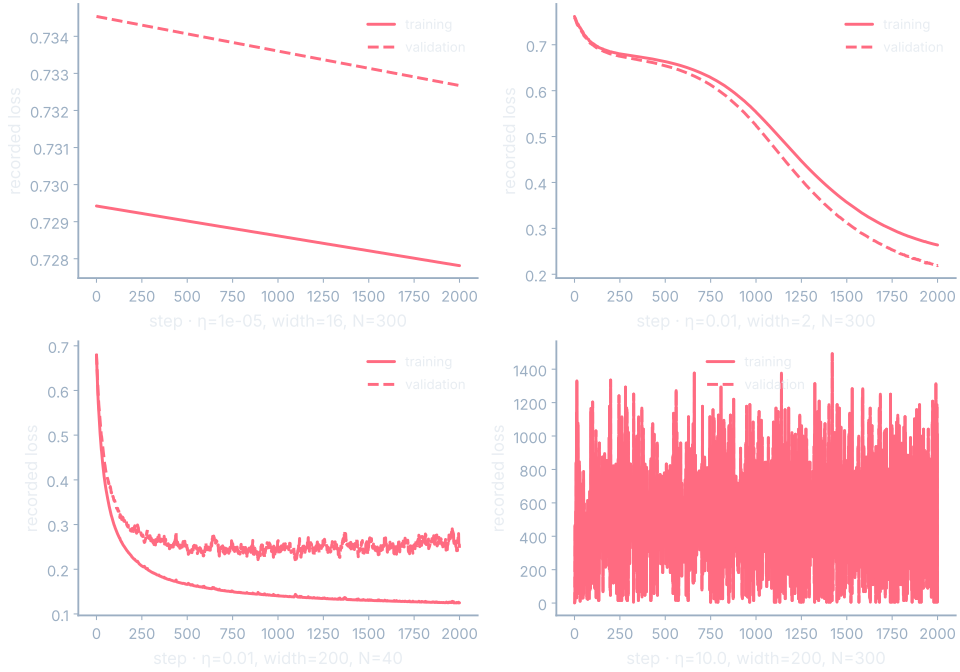
The four cases use actual E9 trial curves. One has learning rate 0.00001 and little change in either score. Another uses width two and improves both training and validation scores. The narrow architecture alone is therefore not proof of underfitting. A wide model trained on forty examples shows a final validation score above its earlier best while training improves.
See it move
Choose a symptom before revealing settings. Compare the evidence supporting it with evidence against an overly strong conclusion. The large-rate case ends at loss 6.081645 but has recorded status complete and finite values. Describing it as nonfinite divergence would contradict the record. A useful next check might compare another rate, inspect gradients, or evaluate an earlier saved state.
E4’s best-to-final validation increase illustrates why development decisions use more than the last training-loss point. We should examine sustained behavior and repeat comparisons on consistent splits. A dashboard can focus that investigation, but it cannot convert a suggestive curve into proof of one causal explanation.
Move one cursor and inspect every panel
The dashboard starts with loss, accuracy, and learning rate. Add panels as each question requires them. One cursor should carry the same progress coordinate through every view, while each sparse array states the step of its latest available preceding frame. This prevents a polished animation from implying measurements that were never recorded.
See it move
Load E3, E4, or E6, compare two runs, or open a local trainkit run.json. Step, epoch, and elapsed-time comparisons use each run’s own coordinate array. When a requested coordinate lies outside a run’s range, the viewer reports that boundary. It does not extrapolate a curve to make both columns look complete.
Where this shows up when you train
A real task may track metrics beyond classification loss. The bundled weather-sr-red.json is a fixed local telemetry import for an EDSRLite model with 1515265 parameters and eight recorded epochs. It is not a live dashboard or a verified deployment gate. Its learned outputs can be compared with a bicubic interpolation baseline at each recorded epoch.
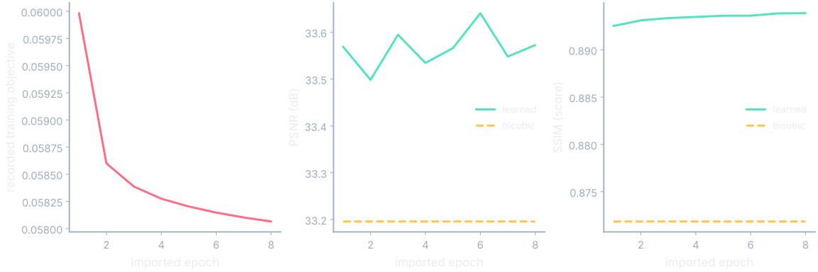
PSNR is peak signal-to-noise ratio: 10 log₁₀(peak²/MSE), expressed in decibels. SSIM, structural similarity, compares local luminance, contrast, and structure. The imported learned PSNR changes from 33.5689598190853 to 33.57240460445901 dB, and learned SSIM from 0.8925286813045485 to 0.8938697116554903. The plotted loss remains its separately recorded training objective.
“Energy” also needs units. A sum of squared signal values is a different measurement from electrical energy in joules. Name the quantity, its calculation, its units, and its evaluation examples on the panel. Those habits let practitioners compare runs without assuming that similarly named traces measure the same thing.
What you now know
- A dashboard connects measurements at a common progress point.
- Training loss alone cannot establish generalization.
- Missing telemetry cannot be reconstructed by drawing a plausible curve.
Where we’re headed
We will now use this dashboard while opening each model family, beginning with a dense network. Continue to the next chapter.